Context
In OneTwoTrip, you can plan your trip: book flights, reserve a hotel, and even choose excursions. I worked as a product designer in the “Hotels” team and want to share one of the challenges we solved. We focused on improving the hotel page — the key section with all the information needed to make a choice.
Task and goal
Our goal was to make the hotel page more user-friendly and intuitive. We wanted users to make faster and easier decisions about whether a hotel suited them. We believed these improvements would positively impact both product and business metrics.
Metrics
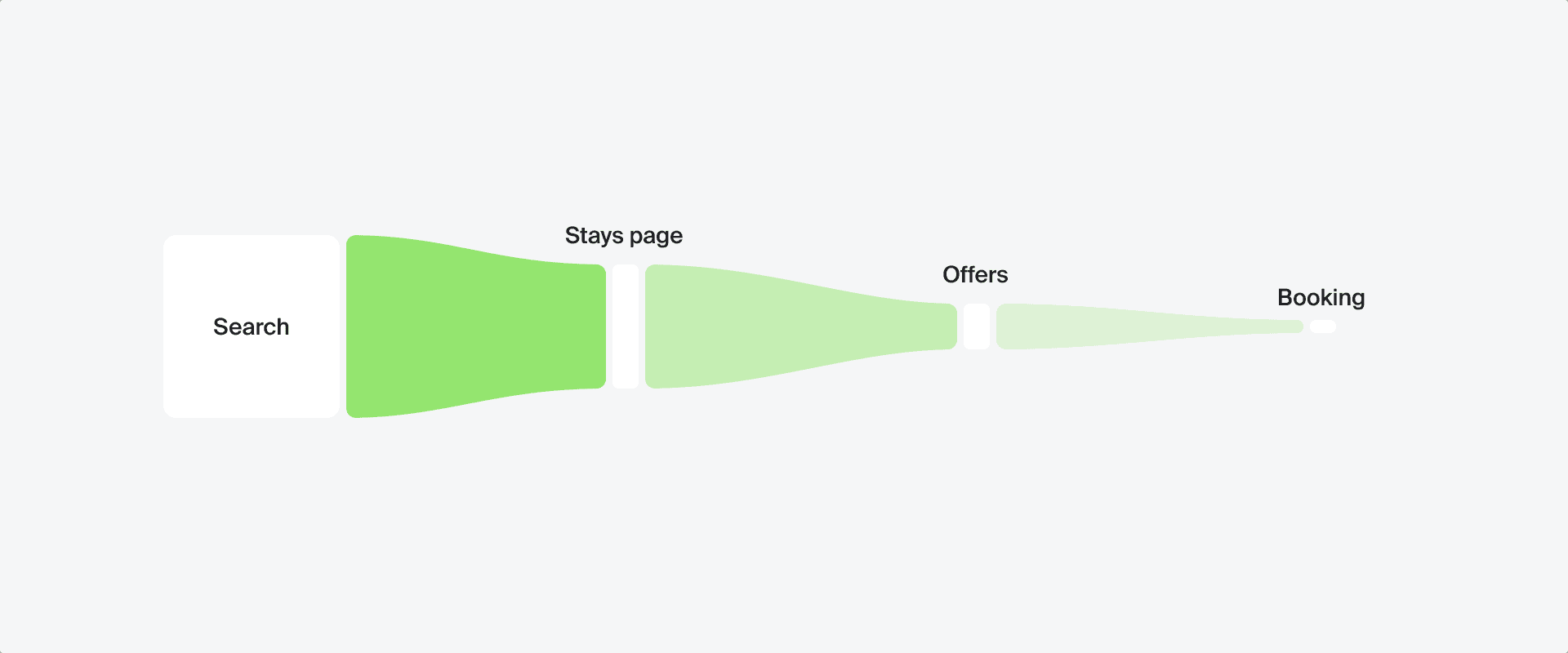
The key metric is the CR for transitioning to offers. Secondary metrics include the conversion rate for adding to “Favorites” and for “Share”
Discovery
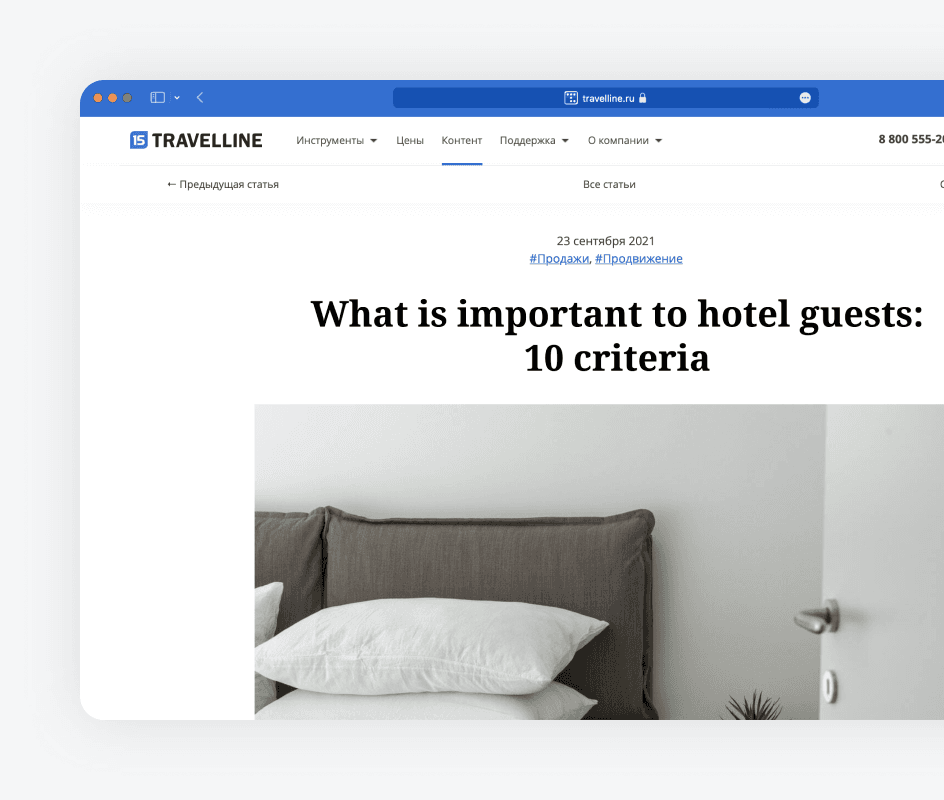
The work began with discovery. We conducted surveys among colleagues who had booked hotels through our app to identify pain points. We also analyzed competitors’ hotel pages to understand trends and spot gaps. Additionally, we researched online hotel booking behavior to learn what matters most to users.
Research results
Through discovery, we compiled a list of hypotheses on how to improve the interface and its impact on the product. To move forward, we prioritized hypotheses based on feasibility and ease of implementation.
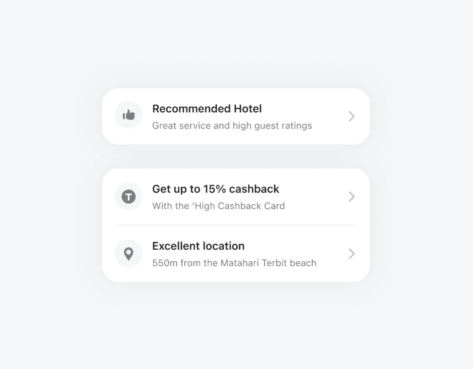
First screen
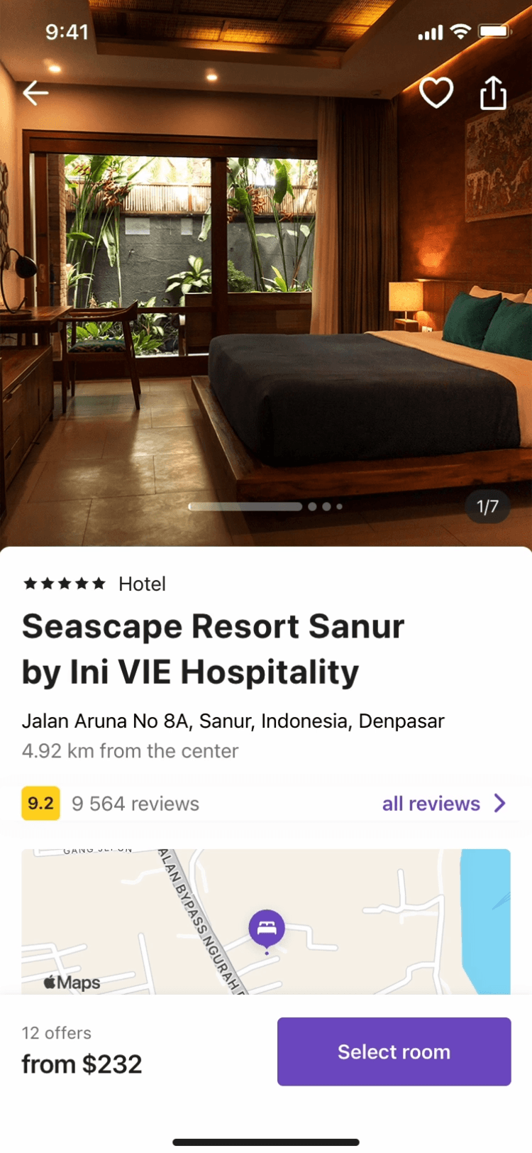
We identified the most important hotel details for users and brought them to the first screen. This helps users form an initial impression and decide whether to explore further or return to the search results
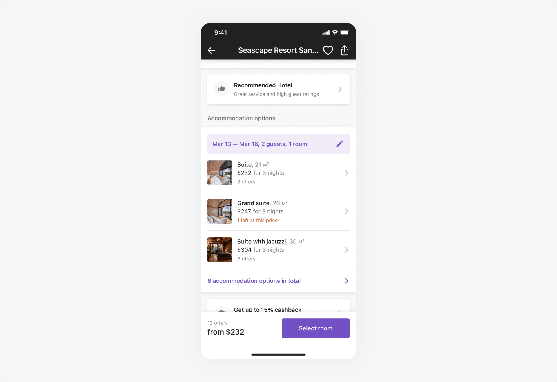
Offers
The “Accommodation Options” block is crucial. It provides an overview of prices and serves as the entry point for selecting a room
Reviews
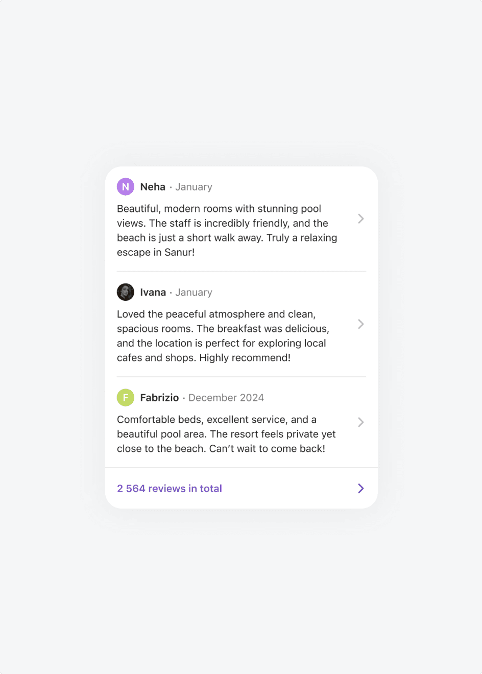
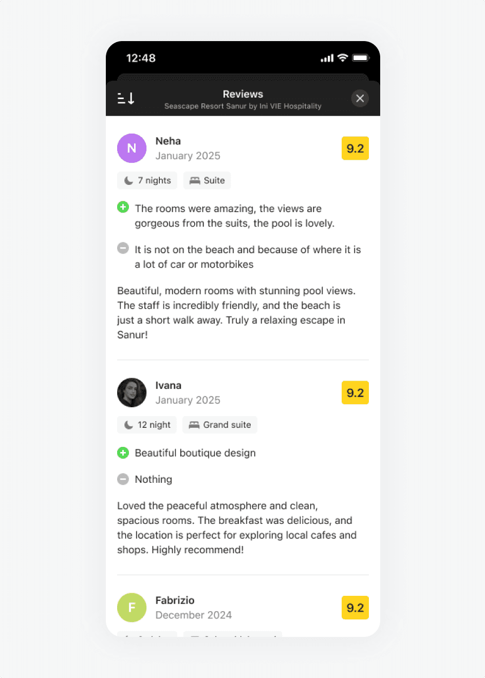
In the new version, we displayed three recent and top reviews instead of one. We also introduced user photos to make reviews feel more authentic.
Other blocks
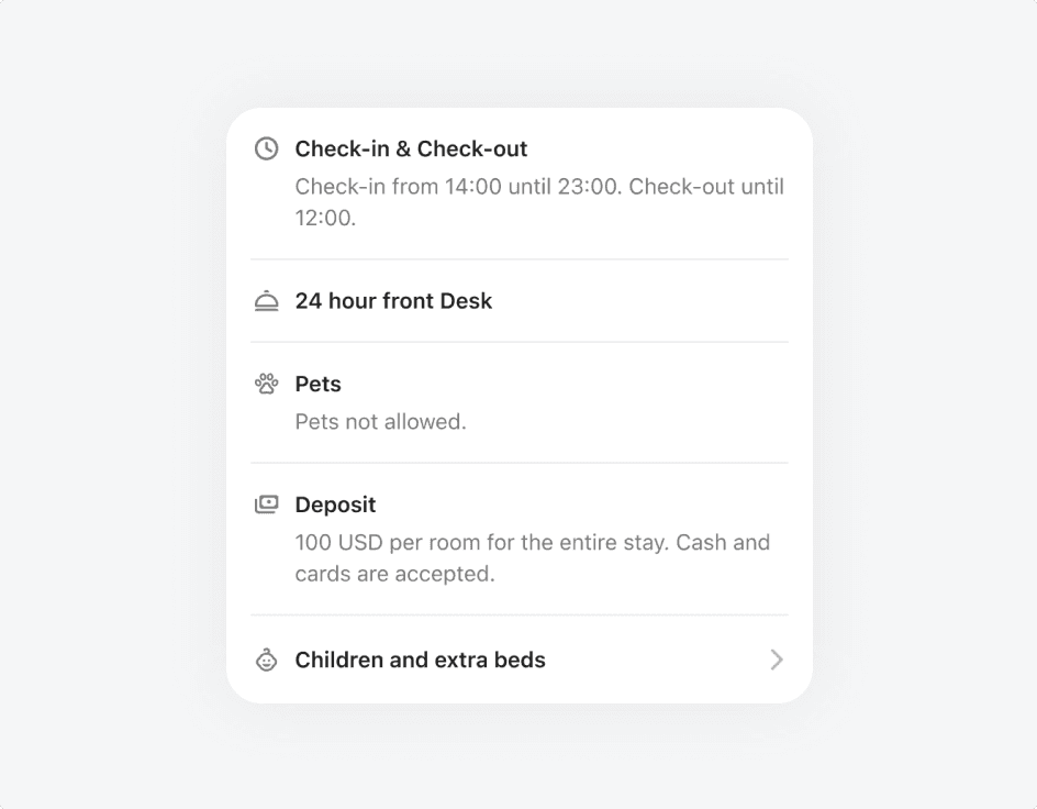
We enriched the remaining blocks with useful details, such as deposit policies, staff language skills, and payment options. The information structure was improved, and the UI was refreshed to be more modern.
Additional pages
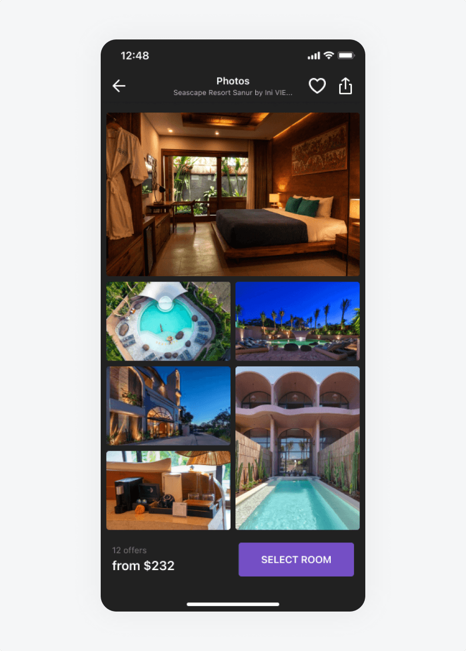
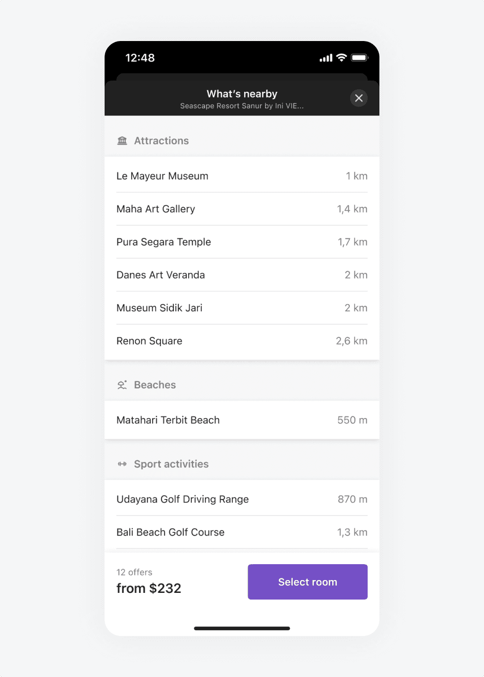
We standardized all additional pages (e.g., reviews and photos) with a consistent style, improved information display, and added CTAs to guide users to offers.
Outcome
We tested the new hotel page through A/B testing. The key metric was the conversion rate (CR) for proceeding to room selection. If the metric increased or remained at the same level, we were ready to make the redesign the default version.
As a result of the test, the CR showed a statistically significant increase, confirming the success of the redesign. We will continue working on improvements, but now with a more targeted approach — focusing on specific sections.